React Native Button Styles
Button Styles
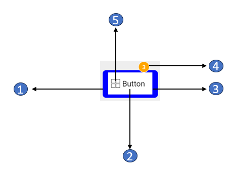
| No. | Class Name | Type | Description |
|---|---|---|---|
| 1 | .app-button | View | To style the outermost container of Button widget. |
| 2 | .app-button-text | Text | To style the Caption text of Button widget. |
| 3 | .app-button-content | View | To style the content wrapper element of Button widget. |
| 4 | .app-button-badge | Text | To style the badge of Button widget. |
| 5 | .app-button-icon | WM Icon | To style the icon of Button widget. |
| 6 | .app-button-skeleton | WM Skeleton | To style Skeleton Loader of Button widget. |
Additional Classes
| Image | Class Name | Type | Description |
|---|---|---|---|
 | .btn-default | WM Button | To style the default button |
 | .btn-primary | WM Button | To style the primary button |
 | .btn-secondary | WM Button | To style the secondary button |
 | .btn-danger | WM Button | To style the danger button |
 | .btn-light | WM Button | To style the light button |
 | .btn-dark | WM Button | To style the dark button |
 | .btn-info | WM Button | To style the info button |
 | .btn-warning | WM Button | To style the warning button |